1
My Landing Page Tips For Small Payout Offers
2
2 Small Powerful Concepts to Explode Your Conversions
3
Neuromarketing: The Weapons of Mass Conversion (Part 2)

My Landing Page Tips For Small Payout Offers

“Do I need a landing page?”

Visit a marketing forum, and you will see this question treated with scorn.

Affiliates are adamant that, 90% of the time, a landing page is required to make money.

You cannot simply direct link paid traffic to affiliate offers and expect to make a profit.

It would be too easy.

Makes sense, right?

90% of the time.

So, assuming that we will probably need a landing page to make money, how do we go about producing a good one?

The Art of the Pre-Sell

When we talk about sending users to a landing page, what exactly do we mean?

We are referring to a page that ‘pre-sells’ the offer.

There are several methods of pre-selling, and some are more controversial than others.

A landing page can be as simple as a form preceded by some bullet points incentives.

Like this template provided by Traffic Plus Conversion:
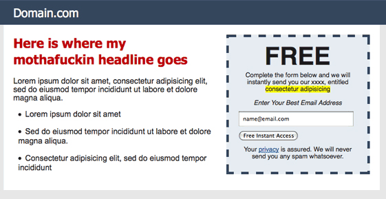
Squeeze Landing Page example

Or it can be as complex (and widely derided) as a fake news article:
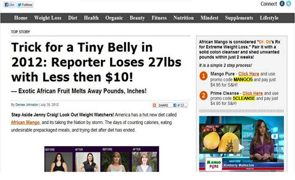
Banned landing page

What is a landing page?

It is a bridge in the sales funnel.

An opportunity to create tension so that when the user lands on the affiliate offer, he is ready to convert.

The only offers where you might not need a landing page are those where spontaneity is inherent in the niche.

App installs, for example.

How many of us read sales letters before deciding whether to install an app?

If your banner is self-explanatory, you can *occasionally* make money by direct linking.

But even then, a landing page that does a good job of displaying the utility of the app, will nearly always perform better.

This stumps many affiliates.

Why?

It’s easy to see why an offer that costs $69.95 would require pre-selling.

The user has to justify a purchase.

When we put our minds to this, we can be quite persuasive.

With a low payout offer, the psychology is different.

The offer may be completely free.

And we overestimate the power of ‘free’.

We expect ‘free’ to do the heavy lifting.

We also overestimate the appeal of immediacy.

What good is the ability to have X now, for free, if X is judged to be worthless?

The silence of non-conversions — particularly when an offer is free — should tell you everything about the importance of creating value through a landing page.

Here are some tips for combining landing pages with small payout offers.

Illustrate the function of the product

Users don’t want to be told what a product offers.

They want to be shown.

Your landing page must illustrate the one relevant problem that your product solves.

Focus on the tension associated to that problem.

Condense it and provide the solution.

Do affiliates promote speed booster apps with sales letters and meandering prose?

No, they use visual storytelling melded to one good incentive, like this:
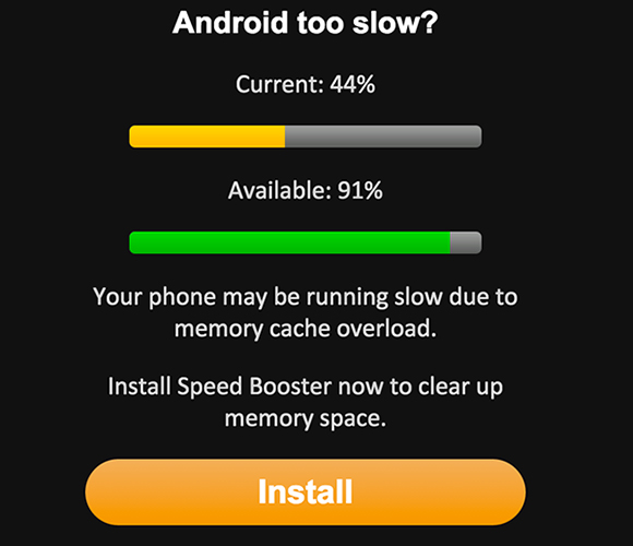
Mobile landing page example

Regardless of your moral stance on this type of install-bait, the app’s utility is plain to see.

The lesson?

Keep it simple!

  • Here’s your problem.
  • Here’s how our product solves it.
  • Here’s how to get started.

The faster you combine these three elements, the sooner you’ll create a funnel capable of monster profits.

Learn to focus attention fast

The worst banners can sometimes produce the best profits.

Affiliates know this.

That’s why the web is littered with ‘creatives’ (I use the term loosely) that look like this:

Download Play Now

Play button

What is the strategy here?

It’s certainly not CPC.

The strategy is simply to get as many users as possible to click through to a landing page.

It’s a method of converting CPM display traffic in to cheaper (and more malleable) pop-style traffic, with a much higher engagement rate than you’d see on pop sources.

A process that goes like this:

  • The banner captures a stray click.
  • The landing page engages the user, very quickly, and plants a desire.
  • The offer sells on that desire.

Offers with mainstream appeal are selected, very carefully, to ensure that the funnel is relevant to a large audience.

You won’t find dating offers for men over 30, but you will find battery saving apps, speed boosters, antivirus scanners, chances to win an iPhone, and Whatsapp bundles.

The idea is that the campaign is pre-targeted to an extent that the affiliate already has a decent idea of who is viewing the ads.

(e.g. Samsung users, Android device, WIFI, USA.)

He focuses on finding a mainstream offer to serve this market.

Then aims to get maximum eyeballs on his landing page.

The landing page is where the battle is won.

Some of the crudest sales funnels in our industry succeed by pairing ‘accidental click’ banners with landing pages that assault the user’s fleeting attention span.

Bold, brash headlines with visual storytelling work well.

So does replicating the look of other popular websites to provide a comfort blanket.

Here are two popular techniques that follow the ‘bait and switch’ banner:

  • Scare tactics — Your phone may be unprotected! Scan now.
  • ‘Too good to pass up’ — I have a chance to win an iPhone? Huh?

In either case, you are likely to induce a reaction along the lines of…

*grunt*
“The fuck are you talking about?”

And it is your landing page’s task to get talking; fast.

Ramp up the tension to act today — this very second.

We are not brand advertisers.

A Shutterstocked banner that makes an inoffensive contribution to a brand’s ‘arcing story’ might secure its designer a promotion, but it won’t put dinner on an affiliate’s table.

We need strong creatives.

It is our number one priority to get a response now; today; in the next 4 minutes and 58 seconds.

One of the most common uses of an affiliate landing page is thus to artificially manufacture a sense of urgency.

We strive for that ‘Shit your pants’ moment.

Some of the greatest hits to our reputation come from affiliates acting too aggressively in this respect.

We do, indeed, succeed in creating a maelstrom of shat pants.

And the stench starts to drift.

Most advertisers treat their offer pages as a shop window.

“Great, you noticed us! Here’s what we offer. Here’s a link in case you want to get started today.”

We affiliates are the expendable sops tasked with standing outside that shop window, dressed as werewolves, and yelling loud enough that passers-by might actually listen.

The landing page is our megaphone.

Your job when designing your next landing page is to think:

“How can I take this product, match it to a burning desire (or fear), ramp up the tension, and then force a resulting action today?”

If your landing page fails to add tension or desire, then it fails.

That’s the acid test for your pre-sell.

Is it so pants-shittingly good that it works today?

Tomorrow is somebody else’s commission.

The Low Payout Dilemma

There are perfectly capable affiliates who overlook entire markets because they believe the offer payouts are too small.

What can you do if the lead is only worth $0.20, or $0.10, or $0.07?

Never mind that the offer accepts traffic in Jordan.

Never mind that click prices are exponentially cheaper.

Never mind that hundreds of thousands of users in a new market are completely bamboozled by their first sighting of the ‘affiliate ad’.

Who needs context, eh?

The story we prefer is “I’m used to paying $0.15 for a click in the US, therefore these offers are a complete washout. The economics are fucking alien. Why bother with them?”

Some affiliates will harbour this contempt whilst throwing $100, direct linked, at a couple of app installs on Decisive.

They assume that because their banner depicts the correct brand, the conversions should swiftly follow.

How simple is that?!

What part of the process instills you with a sense of job security?

Because if you can find it, I’ll buy it.

In a bottle.

And drink it every night.

You have to do better than the average affiliate.

That’s how our industry works in 2015.

  • What can’t you change? The offer.
  • What can’t you beat? The CTR of a ‘Play / Download’ banner.

What does that leave?

It leaves the landing page: your ability to get from A to C.

Your ability to create angles; to illustrate a product effectively; to deliver a blunt call-to-action that is difficult to avoid.

It doesn’t matter how small the payout is.

The result of not selling the offer is always the same: $0.00.

RECOMMENDED THIS WEEK:

  • In case you missed it, my brand new 2015 edition of Premium Posts is available now. Need a recipe for affiliate success in 2015? You won’t find a single resource that covers as much ground as this. 375 pages of my very best tips and strategies.
  • The Premium Posts 2015 Edition is sponsored by Adsimilis. You know all about Adsims, right? They are one of the best CPA networks in the business. If you run any kind of mobile, dating or sweepstakes… then sign up an affiliate account, ca-ching.

P.S. You can read 40 pages of Premium Posts 2015 for FREE by opting in to my monthly newsletter below:

2 Small Powerful Concepts to Explode Your Conversions

Why is split testing so important?

Because small changes add up to big dollars.

My favourite example comes from Colleen Szot, the world renowned infomercial writer who shattered a twenty-year sales record by changing just three words in one of her scripts.

You would miss them if you didn’t know where to look.

She didn’t insert superlatives, or extra promises, or yet another celebrity endorsement.

Here’s what she changed:

Version 1: “Operators are waiting, please call now,”
Record breaking Version 2: “If operators are busy, please call again.”

And sales took off in to the stratosphere.

It would be disingenuous to suggest that small wordplay can turn a losing product in to a multimillion dollar success. But it can certainly shape a winner.

Conventional sales logic says: make the sale as pain-free as possible.

Why would you piss off the customer by threatening to waste her precious time on hold?

Szot would argue that believable social proof is worth it.

After all, who is more likely to rip out your eyeballs?

The salesman peddling a product that is flying off the shelves, or a call centre full of eager, idle lions who haven’t been fed for days?

Whatever you are selling, you will sell more by adding social proof.

If you are in the service business, this means appearing busier than you actually are.

You are publicly seen to value your time; your writing is concise, your communication succinct. The world knows you refuse to take a shit without checking your calendar first. It’s a staple of your vocabulary that you only ever have room for one extra client.

If you are selling products, this means threatening to run out of them, or stop selling them, or start raising the price on them. Whatever you are selling, the cost of not acting now is always going to rise exponentially (even if the price doesn’t).

In both cases, the best possible reason for denying a customer your service or product is because somebody else got there first.

It’s annoying to walk in to a shop and find that shiny new gadget is out of stock. But it stings to see the last box snatched up by the guy ten paces in front of you.

Social proof creates intrigue, desire, validation.

Scarcity creates a monster.

Every piece of sales copy you produce should have both.

Extra: Read more about how I use social proofing and scarcity in my neuromarketing post series, originally published in 2012.

Neuromarketing: The Weapons of Mass Conversion (Part 2)

Note: This is the second of a two-part series on Neuromarketing. Read the first part here.

Previously we looked at how social proof can lead to more conversions, more sales and more money in your bank account.

Social proof is a cornerstone of neuromarketing.

But it’s not the only child.

In this post, we’re going to look at three of the most powerful selling techniques known to man. Some might call them the twisted twins of social validation.

These techniques are capable of wreaking some serious havoc on the fickle, fanciful minds of our target markets. Which is why I ask – no, plead – that you repent for your sins and wash your keyboard in soap after usage.

The three techniques are:

  • Scarcity
  • Reciprocation
  • The need to rationalize decisions

There is plenty of academic research to suggest that the techniques above are Grade A weapons of mass destruction in the war of selling. Yet still there exists a shortage of examples for how these techniques can be adjusted to the modern web.

Well, that’s what I aim to show you in Part 2 of this series.

Let’s start by looking at scarcity.

How scarcity sells

Scarcity works in tandem with social proofing. Like two magnetic forces pulling a consumer to shipwreck. Together, they are irresistible.

I gave an example of one of my preferred scarcity tactics in the previous post.

“There are currently [17] people viewing today’s offer.”
“[654] people have signed up since October 1st.”
“We have exceeded our capacity! The offer ends in X.”

If you’re too late, don’t worry. We’ll be reopening our doors in December.

Scarcity is the threat of not having. You can see it being used in these popular sales ploys:

  • “Only limited tickets remaining.”
  • “Accepting [7] new affiliates.”

For scarcity to take effect, supply must be limited and demand must be present.

The guys over at IMGrind are pretty adept exponents of this equation.

IMGrind holds live masterminding sessions at factory line frequency. The events are an opportunity for Internet Marketers to get together and discuss strategies that are currently making money online. While I cannot vouch for how effective these sessions may be, I do admire the precision that goes in to their marketing.

To my knowledge, their latest live event had just 20 seats available. They were selling these tickets at $247 a pop.

IMGrind Recording

Scarcity sets the price point

Setting such a short supply of tickets provides two opportunities:

  1. It gives IMGrind an excuse to bombard your email with headlines like “Just 4 Seats Remaining! Book Now or Never

  2. It adds value to their second option, which I assume is their primary method of monetizing the event: DVD recordings. It sends out a message, “This event is full of so much smoking hot info, we can only show it to 20 people. But you, you don’t have to travel to New York City. You can get a copy of the DVD and watch from home.

Of course, when the live tickets do sell out, the event gains prestige. Users are far more likely to part with their wallets.

And what about those $247 DVD prices? Pretty extreme, don’t you think?

If somebody offered me a DVD for $247, I would kindly take the disk, snap it in half, and take a swipe at their jugular. But this price works.

Why does it work? It works because the anchor has already been set.

The event tickets are selling out fast at $247. You have social proofing that the event is worth at least $247. You also have the scarcity of tickets painting a subliminal message in your head that you will be missing out on something great.

The information is not easy to access. Some marketers are travelling to New York City for the session. Let’s be honest. How far out of bed would you crawl for a free WSO?

Remember: The harder it is to obtain, the greater the perceived value.

The final sucker punch in this awesome sales funnel is when IMGrind promotes the aftermath of the event.

They will duly blitz your inbox with success story after success story of how attendees have breathed new fire in to their careers after making the trip. This information is usually followed by an announcement: the DVD recordings will be taken offline in X days.

All that priceless information…

Gone. Vanquished. Never to be seen again.

What you are left with is a scarcity of time + a scarcity of information. Without knowing the exact IMGrind financials, I’m sure they’ll be eating pretty sizeable turkeys this Thanksgiving.

The lesson of scarcity: When we perceive information as being too easy to get, we lower the value of that information. Conversely, we can set high expectations and high demand by raising our prices and creating a bottleneck.

Open up a newspaper and chances are you will find a page dedicated to a stand-up comedian who has inexplicably miscalculated the demand for his shows.

Jimmy Carr on Tour

Jimmy Carr. One of my favourite comics.

Jimmy Carr on Tour!

January 10th, Birmingham, SOLD OUT
January 11th, Birmingham, SOLD OUT
January 12th, Birmingham, EXTRA DATE ADDED
January 14th, London, SOLD OUT
January 15th, London, SOLD OUT
January 16th, London, SOLD OUT
January 17th, London, EXTRA DATE ADDED

Of course, the marketing agencies responsible for these ads know exactly what they are doing.

By releasing extra dates ‘due to popular demand’, those terrible twins – scarcity and social proofing – can begin to work their magic.

You can try to fight it. You can try to analyse every last piece of advertising that comes your way, but there is simply too much of it. And it comes too fast.

Scarcity creates an illusion of desirability. Human nature simply cannot help itself.

You will desire that which is not easily available to you.

If you are reading this blog, I can assume that you are familiar with the sales text: “Only [7] spots remaining. Sign up now!”

More recently, marketers — being marketers — have upped the ante.

For when a static scarcity scare simply isn’t enough, there’s always the animated countdown:

7 Spots Remaining

Sped up and repeated for illustrative purposes.

And if that doesn’t shoot the fish in your barrel…

There’s another particularly fiendish technique that involves JavaScript and a ‘Spots Remaining‘ tally that decreases every time the user fills out a text field.

I have experimented with this method on long forms and I can say without doubt: a shrinking supply lubricates engagement.

Those who start entering their information simply cannot stop, no matter how crude or obvious the manipulation.

Just watch those little fingers scurry! And then hang your head in shame.

How reciprocation sells

Reciprocation is, and will always be, the friendly plague of Internet Marketing.

I still remember when link exchanges were a sophisticated form of marketing. When places on blogrolls were squabbled over. When the Warrior Forum was a circle jerk*

* It’s gotten worse. Like a bad wine.

Do you remember MySpace? Of course you don’t. Only Justin Timberlake remembers MySpace.

I tell a lie. My one lasting memory of MySpace was that of the world’s most reciprocal social network.

At least 90% of my actions on MySpace were down to the compelling forces of reciprocation.

“Hey Finch. I just added you to my Top Eight Friends. Wink, nudge.”

“That’s extraordinary news, Brianna. One might call this the proudest day of my life. I guess you’ve risen through the ranks to become my 6th bestest friend. Come and refresh the page. Oh, and jolly well done.”

7 seconds pass.

“Look Finch. I just answered this cool survey and chose you as my friend ‘most likely to die in a hideous car crash before the age of 21!‘ You should do it too.”

“No way! I just answered it. You were my friend ‘most likely to get pregnant in the back of a bike shed and have 3 kids before the age of 25!’

7 years pass and Finch is proven correct.

MySpace was a lot of things. But above all, it was a land of scratchy backs.

While I hope you have set your goals higher than landing on somebody’s Top Friends list, the psychology behind sites like MySpace can tell us a lot about how we behave.

Reciprocation is embedded in our psyches, particularly on a social level.

What many skilled marketers have noted is that reciprocation can be just as effective when it comes to selling.

We call it the ‘feeling of indebtedness’.

Every squeeze landing page in history owes its success to our feeling of indebtedness. It’s the reason why we don’t unsubscribe immediately after downloading a free giveaway. We understand that there is an exchange in place.

Historically, when we roamed the earth as cave men, to break the law of reciprocation would have been to invite trouble. In most cases, a club to the back of the head.

We have evolved, but elements of the old brain still exist.

You can tap in to this evolutionary hallmark by priming your web users via reciprocation.

How about a free gift? A little ‘something for nothing’ that looks innocuous but casts that sinking feeling of indebtedness.

When launching Premium Posts Volume 6, I used reciprocation in the form of a sneak preview of the product.

Users were able to access 10+ pages of material without paying a penny.

Note: And if you wish to receive the same perk with Volume 7, I suggest you opt-in at the bottom of this post!

The purpose of giving away content I had shed blood, sweat and tears for was not to be a good samaritan. Do I look like a good samaritan? It was to induce a feeling of indebtedness so that someday, perhaps not for several weeks, the sale would arrive.

A key element of reciprocation is that the scale of the good deed rarely matters. I may literally only scratch your back, but if you accept it as a favour, a seed of indebtedness has been planted.

The next thing you know, I’m inviting you to bed…

That’s great. How do I use reciprocation to make more sales?

One of my favourite techniques is the double tiered landing page. It traditionally involves a free giveaway; usually an ebook, or a personalised report; followed by a CPA offer.

The user lands on my page and is asked to submit his name and address to access my prized content. As soon as he has done so, he’s hit square in the chops with a CPA offer wrapped around a very carefully worded recommendation.

It rarely goes like this, but I hope you get the gist:

“Hi Derek, thanks for downloading my free report on ‘How to Save Endangered Hawaiian Seals’.

It took MANY sleepless nights to compile. But I hope you love it.

Just one more thing, if you’re really looking to save some seals, can I give you a recommendation?

AdoptAPremiumSeal.com is my partner’s site.

If you feel a nagging sense of indebtedness to take action, you should definitely check it out. After all, you have already shown me what a worldly soul you have by requesting my report. Most people are too cruel to get this far.

The next logical step, as I’m sure you are aware, is to adopt a seal. Right now.

Seriously, I’m waiting to take your call.

I’d really appreciate it. And I know the seals will too!

Note: I have used seals as an example, but I suppose you could easily use the same copy for ‘Fat Local Slags’. They need homes too.

If it seems like a ridiculous example, I have to tell you… people commit to some ridiculous shit, especially when they feel that they owe you.

Whatever gets the reciprocation monkey off their back.

The lesson of reciprocation: If we want people to take action, a small favour will go a long way. Aim to plant a seed of indebtedness before the user reaches your sales pitch. There are many ways to achieve this on the web. The most potent weapon is a taste of the information they crave. If you can personalise the information, the results will be even greater.

How the need to rationalize decisions sells (over and over again)

Selling to a customer once is the weather smiling on you.

Selling to a customer for the rest of his life is a job well done.

Marketers like myself too often forget that the big money lies in attracting lifelong customers. We affiliates, we love to rinse and burn.

We’d rather attract a million first time sales than deal with the threat of speaking once more to those we’ve used and abused.

The reality? It’s not easy to attract a lifelong customer.

You mustn’t only attract the customer’s wallet. You must attract his best judgment, his sense of identity and his underlying belief that the decision to choose your product was correct. If this belief does not exist, his first conversion will be his last.

Business models cannot stay healthy without customer loyalty. And so providing sweet assurance that a purchasing decision was correct is just as important as getting the bloody minded fool to bust out his plastic in the first place.

How can we help a consumer to rationalise a decision?

There are two techniques that I want to look at:

  • Appealing to the user’s sense of identity pre-sale.
  • Altering the user’s perception of an experience post-sale.

Appealing to the user’s sense of identity

I have tested hundreds of landing page variables. I can’t think of a single variable quite so potent as the ability to tap in to a user’s sense of identity.

Consumers buy products that align with their opinions.

The products they love most are those that make them feel good about themselves, while expressing who they are.

The very first impression your landing page should create is a sensation of Us Against The World. You should know your target market well enough that you can express their single biggest fear in the headline, along with the solution (your product, obviously!).

Look at the Work at Home Mom industry. It draws in thousands of mothers every single day on the basis of what exactly? No more than a sense of identity.

I am a work at home mom.

Yes, you are.

And I am much more likely to sell merchandise to you if I pretend that I am one too. Of course, you’ll never believe me. My tits are too hairy.

You need only look at, oh say, every single religion in the world to see how tribal the human race can be. Neuromarketers understand that what we call in-group bias – the tendency to side with people who share common ground – is an incredibly powerful sales engine.

Appealing to the user’s perception of experience post-sale

Not only will people buy what they believe in. What people buy will often shape what they believe in.

If you want to create a lifelong customer, you can’t leave them at the checkout cart.

Every single Multi-Level Marketing sucker I have encountered has been programmed to believe, with devout faith, that his money is being invested wisely. That’s because the MLM experience relies on shaping the user’s perception after the initial sale/investment.

Now, look at your own sales funnel.

Do you forget about your customers from the moment the sale is made?

You shouldn’t. This is the time to pounce.

If you want to create your own tribe, your own dedicated group of followers, you have to instill the belief that your product is an extension of their own identities.

Don’t restrict freebie giveaways to your non-customers. Provide the best benefits to those who are already your customers. Don’t be afraid to develop an email follow-up series after a sale has been made. And always promote your successes.

IMGrind, the scarcity exponents I referenced at the start of this post, are equally skilled at promoting their successes. An IMGrind event will rarely pass without an email landing in my inbox with the success stories that came out of it.

Following up an event or a sale with positive associations is one of the best ways to ensure that your customers stay loyal. It lets you mould their perception of what you offer.

Reflections on Neuromarketing

This has been a long post, and my fingers are chaffed. If you are still awake, I salute you.

The truth is, neuromarketing is deserving of both your time and attention. It is one of the most exciting, baffling and lucrative fields you could hope to explore.

We can’t control how we are wired as human beings.

Sure, we can make what we might consider to be logical decisions, but they are usually driven by split second judgments that marketers are only just beginning to exploit.

If you really want to understand how to increase conversions, it’s those split second judgments that you need to learn and embrace.

I’ll finish this series by offering a book recommendation: Thinking, Fast and Slow.

Read it. Read it again.

You will soon begin to understand how little we actually know about ourselves. And how what little we do know can be exploited by marketers with money on their minds.

Recommended This Week

  • Be sure to check out Adsimilis, the official sponsor of Premium Posts Volume 5 & 6. Adsimilis is one of the most effective networks in the world for CPA affiliates. Lots of offers, lots of high payouts, lots of exclusives. Sign up now.

Copyright © 2009-.